
I've recently been experimenting with art for dialogue interactions in our game, The Attestation of Sköll. We wanted characters to have unique dialogue boxes and interaction prompts to give character to the human spirits, gods, and creatures we plan to add, so I created some proof-of-concepts for achieving something more than simple dialogue box sprites would allow.
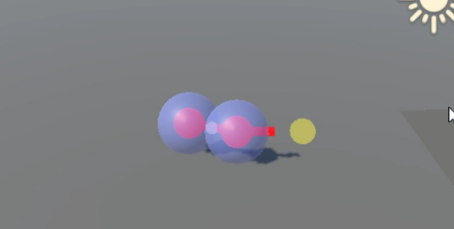
My first experiment was to use a 3D dialogue box mesh, which was rigged with an armature to allow it to be scaled the same way a 9-sliced UI sprite can in Unity; 9-slicing lets you scale the sprite while preserving certain aspects of it that you would otherwise lose with naïve scaling, such as the shape of corners.
I created a script that positions the bones of the dialogue box such that a piece of text content will fit inside it, and the result was passable, but I quickly realised we couldn't simply map a texture onto the mesh without it being stretched awkwardly.
To try to solve this, I mapped a tileable texture onto it with object-space positioning rather than UVs, so the texture itself wouldn't stretch. I experimented with mapping some detail onto it in the same way (moss and cracks), but with a mask mapped in UV space so we could control the areas that had particular detail. Although the mask stretches as the mesh does, it's not as visible in the result because we map the detail textures themselves in object space.
3D Approach for Carven Stone
I wanted to try creating a carven look to text presented on this particular box - being made of stone I thought it would make sense to have the letters chiselled into it, perhaps with a gentle glow to make it appear mystic.
Thankfully, Unity's TextMeshPro plugin not only sorts most of the text logic for us, but has a very customisable shader for text that allowed us to create the carven normals purely through the material parameters. The glow I was hoping for is also just another parameter on the text shader, and the result is pretty much perfect.

To transition between text content, I wanted to fade the characters in, so they'd start off being barely chiselled into the surface and then form deeper shapes as they appear. Through some vertex colour trickery, I managed this by assigning the alpha value of the vertices for each character (powered by a script), and then modified the shader to use the alpha value as a modifier for the dilation parameter, which results in the characters becoming thicker over time.
While we liked the final result of this experiment, we thought it might be too noisy and complicated to be easily readable at all distances, so I started working on a sprite-based solution.
2D Scaled Sprite Approach
Our artist tried to concept some 9-sliceable dialogue box sprites that would scale nicely while keeping a lot of hand-drawn detail, but early testing showed us that any fancy borders or detailing would be stretched or tiled awkwardly. A semi-successful approach was to have certain floating border details, such as branches affixed to edges or corners, with a scaled background sprite underneath:
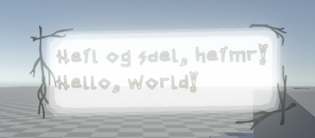
2D "Fixed-art" Approach
While this looks passable, I wanted to find a way to preserve the artistry of the dialogue box mockups our artist made. Instead of using a scaled sprite, I tried using some quickly mocked-up fixed-size sprites of various sizes that are selected based on the length of the text content:

These fixed designs meant we could have as dialogue boxes that were guaranteed to preserve any flair and shape we wanted, while still fitting it to the text content. To transition between the different sizes, I first tried swapping out the sprite and transitioning from the previous sprite's size up to the current sprite's, so it would create the illusion of morphing between them. While this looked quite clean and energetic, I also tried replicating a transition effect I saw in Supergiant's Hades, whereby a noisy swipe mask is passed over the sprite, darkening and highlighting parts of the sprite:

Comments
Post a Comment